I've applied to dozens of jobs in the past few months. This week, I stopped waiting for callbacks and took control of the one thing I could: my resume.
I'll walk through how I took a PDF resume template and turned it into my own editable version — one I can fully customize. For instance, I wanted to make the capital letter of my name 20% larger than the rest. Because why not?
The Original Design
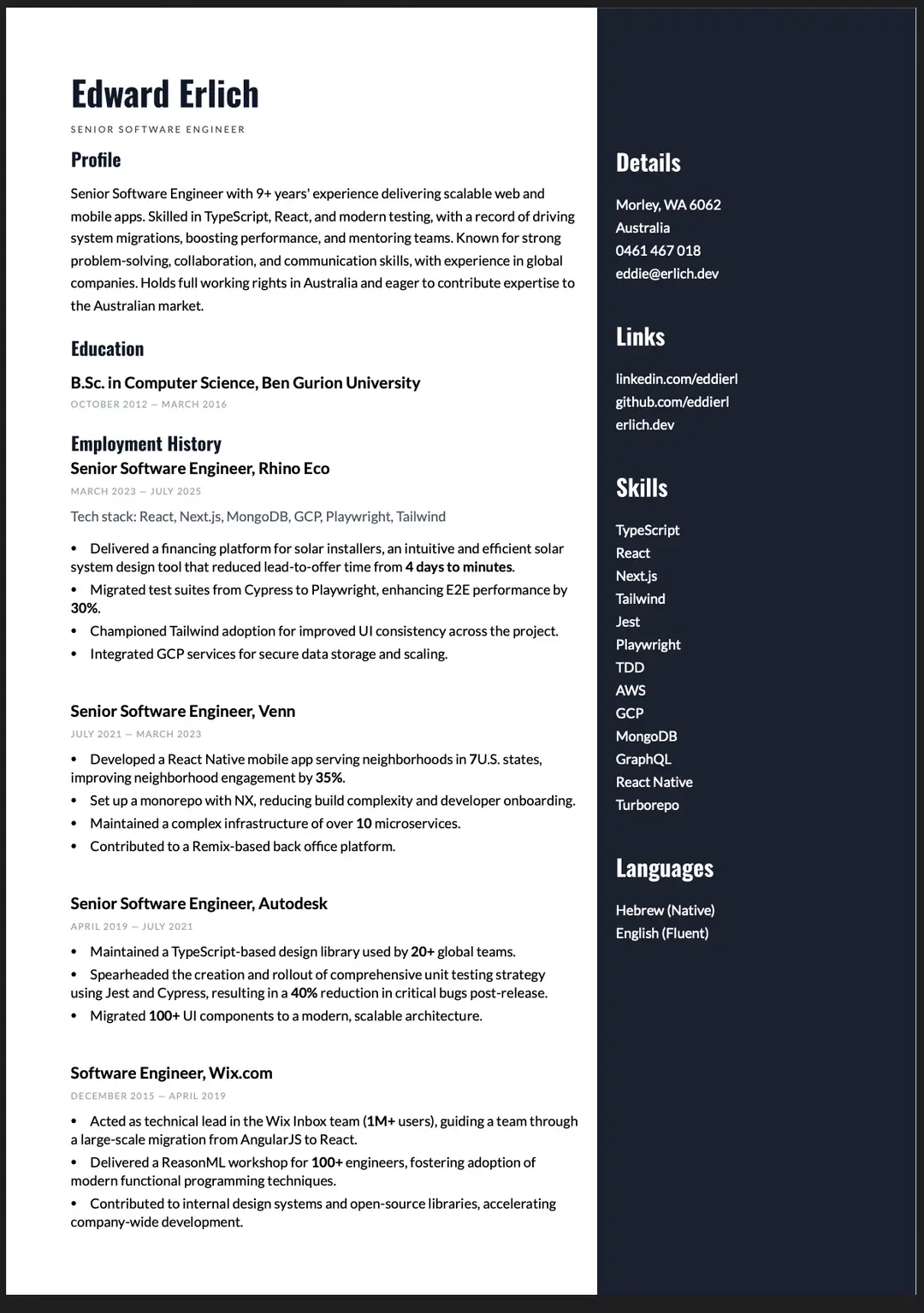
I originally created my CV on resume.io. It had a clean two-column design that I really liked — elegant, modern, and perfect for all those automated screening algorithms. I even paid to download the PDF.
A few months later, still job hunting, I revisited the file. It looked fine, but I realized it completely lacked modern keywords — nothing about AI which is pretty essential these days.
First Attempt: Plain HTML
Let's get technical.
Whenever you open a web page, you can export it as a PDF using your browser. If you haven't tried it before: File → Print (Ctrl + P) → Save as PDF.
That's where I began.
I rebuilt my resume as an HTML page based on the original design I liked. It looked quite similar, but the file size nearly doubled:
- Original: 34 KB
- My version: 65 KB
Around that time, I landed a promising interview and paused the project — maybe I wouldn't need the CV after all.
You know how that story ends. Didn't get the job.
Back to work.
Second Attempt: Using React PDF
This time, I went looking for a code-based solution and found react-pdf. After reading through the docs and examples, I dove in.
I used AI to parse my original CV.pdf into a structured JSON object — experience, education, skills, everything. Here's what the structure looked like:
{
  "profile": {
    "name": "Edward Erlich",
    "title": "Senior Full Stack Developer",
    "summary": "Full-stack engineer with 10 years building scalable web applications..."
  },
  "experience": [...],
  "skills": ["TypeScript", "React", "Node.js", "Go"]
}
Then I built a layout to render that data in a PDF document. It was starting to come together.
The Font Problem
However, the fonts looked terrible. The AI hadn't extracted them correctly. I discovered the original used two font families, each with 400 and 700 weights. After some digging, I found the right versions online and manually loaded them into the project:
Font.register({
  family: 'Lato',
  fonts: [
    { src: './fonts/Lato-Regular.ttf', fontWeight: 400 },
    { src: './fonts/Lato-Bold.ttf', fontWeight: 700 }
  ]
});
Finally — it looked right.
Manual Fine-Tuning
At that point, only small issues remained: font sizes, letter spacing, and margins. These were beyond the AI's help, so I spent the next 4 hours adjusting 20+ different spacing values by hand.
What I Learned
React-pdf isn't just a PDF generator — it's essentially React for documents. You're not converting HTML; you're building a separate component tree with its own layout engine. That's why the font registration was necessary, and why pixel-perfect matching required manual tweaking instead of CSS copy-paste.
Final Result
After several rounds of fine-tuning, I was happy with how it turned out. I added some new "AI" and "Go" buzzwords in my profile section, and the result feels like a proper CV.
You can view the final PDF here.
I've also made the project public on GitHub — fork it to build your own, or explore how react-pdf handles complex layouts: https://github.com/eddierl/portfolio
Now I'm sending it to a few colleagues and contacts in Perth. If you're hiring and need someone who obsesses over letter-spacing and ships production code, let's talk. ✌️